

Splitting a life-settlement underwriting tool by audience
A life-settlement brokerage sent every visitor to its in-house underwriting and valuation tool through one three-option landing page, whether a policyholder cashing out a policy, a financial professional referring a client, or someone bulk-uploading a book of business. The single entry point steered people into the wrong path, and the tool's PDF export, the document new leads needed to move forward, returned a server error. We audited the tool end to end and specified a split by audience.
Executive Summary

Context
The client runs an online life-settlement auction platform, connecting policyholders, financial advisors and producers with settlement brokerages for competitive bids on in-force life insurance policies. Its own underwriting and valuation tool, built in-house on machine learning, qualified all three audiences through one generic entry screen.

What We Built
The client left the audit holding a screen-by-screen breakdown of its underwriting and valuation tool: where the shared entry point misrouted policyholders and financial professionals, where the agent-facing view carried underwriting assumptions the policyholder view omitted, and a specific plan to split the entry point and fix the failing PDF export.

Tech Stack
- In-house machine-learning-based underwriting and valuation web application
- WordPress (site CMS hosting the tool's public entry points)
Not a fit if your underwriting tool and CRM already live on one unified platform: this audit's value came from mapping a self-select flow across a WordPress site, a valuation app, and a Salesforce-managed pipeline sharing no system of record. It also assumes you can act on findings independent of a stalled systems-integration workstream, since the audit surfaced UX problems that workstream never resolved.

The Challenge
Every visitor to the underwriting and valuation tool landed on the same three-option screen and then ran through the same valuation flow. That included policyholders, financial professionals and people bulk-uploading a book of policies. The agent-facing view carried an underwriting assumption, an instruction to price using full mortality, that the policyholder view never showed.
New leads who tried to save their valuation as a PDF hit a server error instead. They didn't have any other way to keep the number they had just been given.

Our Approach
We started at the entry screen, where one self-select choice (policyholder, financial professional or bulk upload) fed the same calculator and the same policy-type and health-rating inputs whatever the answer. We then traced what each choice loaded. The agent and policyholder paths differed only by a content toggle, with the "use 100% mortality" instruction switched on for the agent view and off for the policyholder view, so the two audiences weren't really separated.
Next we ran the flow to its last step, the "Download as PDF" action, and reproduced the internal server error on a new lead ourselves instead of logging it as an unconfirmed report.
Our recommendation replaced the single screen with two entry paths, each carrying only the underwriting detail its audience needed. We named the PDF failure a defect for engineering, not a copy problem.

Impact

Policyholders and professionals now see separate paths
The audit named the exact screen serving both audiences the same underwriting content, then specified two entry paths in its place. The client can now brief developers from a documented decision, not a complaint about confusion.
A known defect instead of an unconfirmed complaint
The audit reproduced the "Download as PDF" server error on a new lead directly rather than leaving it an unconfirmed report, giving the client a defect with a known trigger to route straight to engineering.
Agent-only underwriting language stays off the policyholder view
The audit traced the "use 100% mortality" underwriting instruction to the agent-facing view alone. The client left with a documented boundary between what an agent needs to work a case and what a policyholder needs to decide.
A documented map instead of a general refresh
Walking the tool screen by screen gave the client a map of exactly where audience assumptions were built in, a scoped starting point for a redesign it can defend to stakeholders.
The entry point asked every visitor to choose policyholder, financial professional, or bulk upload before the same valuation calculator ran. The audit used this screen as the trace point for every defect that followed.
The agent-facing valuation view carried an explicit instruction, "use 100% mortality," that the policyholder view omitted. That gate is what proved one template was serving two audiences it was never built to separate.
The "Download as PDF" action, the step a new lead needed to save a valuation, returned an internal server error instead of a file. Reproducing the failure directly, not a support ticket, is what let the audit name a specific trigger.
In place of the single three-option screen, the audit specified two entry paths, one for policyholders and one for financial professionals, each carrying only the underwriting detail its audience needed. Bulk upload stayed separate rather than folding into either path.
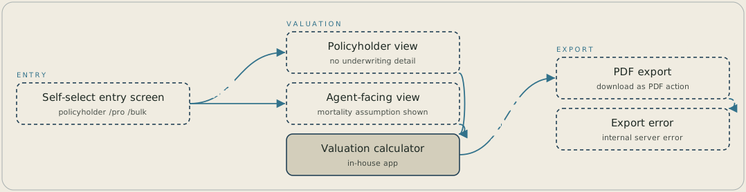
A visitor starts on a self-select entry screen and chooses policyholder or financial professional, which sends them to their own view of the same in-house valuation calculator. Both views pass policy-type and health-rating inputs to the calculator, but the agent-facing path adds a mortality-assumption instruction that the policyholder path doesn't carry. From the calculator, the "Download as PDF" action is where a new lead hit an internal server error.
FAQ
Adding more explanation wouldn't have fixed the real issue: one template served two audiences with different underwriting knowledge on the same screen. More text would only make the agent-facing language more visible to a policyholder who shouldn't need it. Splitting the entry point let each audience see only what it needed.
We ran the flow through to the "Download as PDF" step on a new lead and reproduced the server error directly, rather than taking a single report at face value. That confirmation let the audit hand the client a defect with a known trigger, not an intermittent issue to chase.


